
How to Make Your Nonprofit Website More Mobile Friendly
Mobile-Friendly Websites: The New Baseline for Nonprofit Fundraising Success
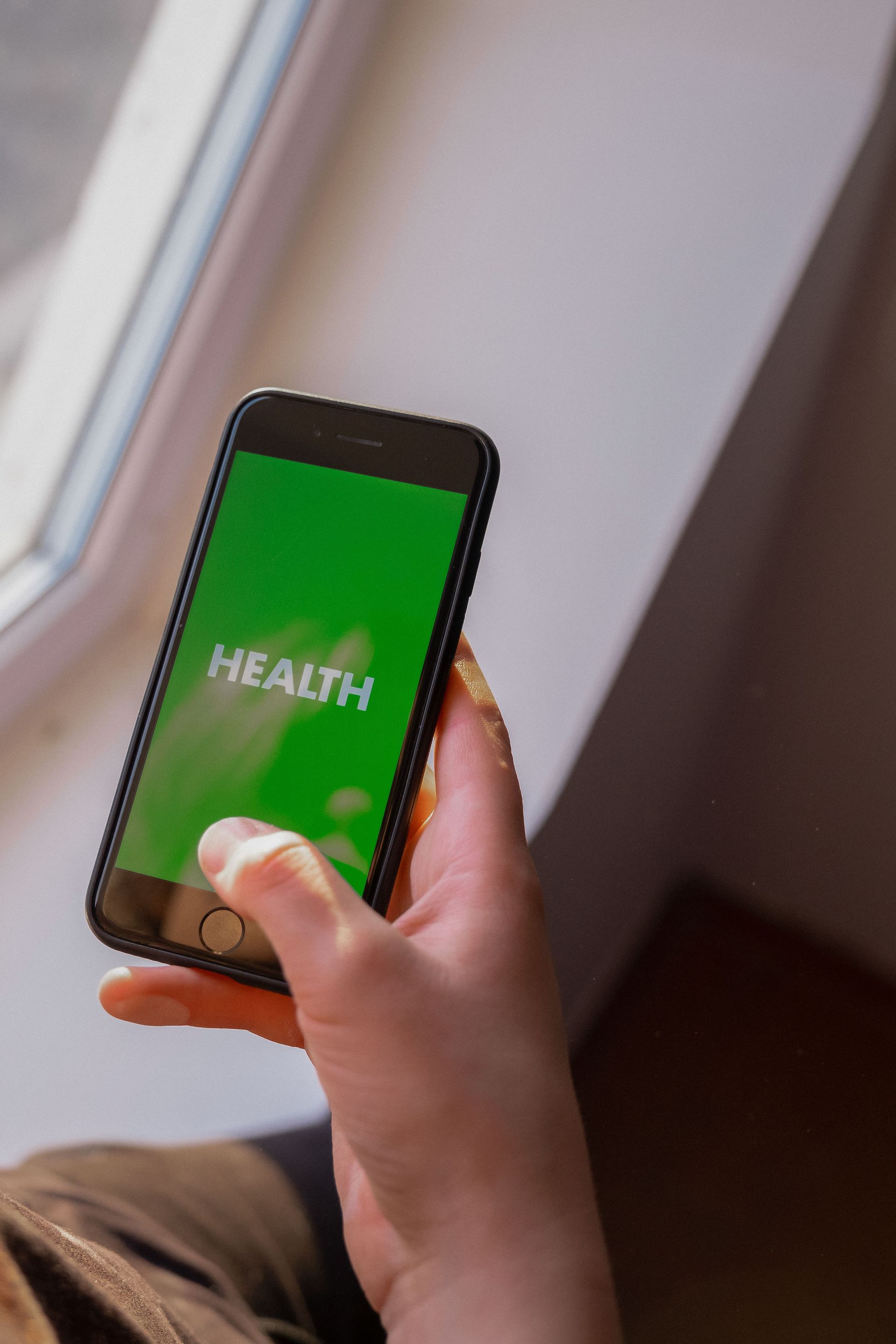
Mobile devices account for most of the traffic to nonprofit sites in 2026. Responsive design isn't a nice-to-have anymore. It's the baseline.
Supporters now discover missions, read impact stories, and complete donations on their phones, often during a commute or a few minutes of evening downtime. If your site doesn't work well on a small screen, you lose that moment. Easy-Click Web Design has helped numerous Arizona nonprofits turn outdated sites into mobile-responsive platforms that simplify giving and extend mission impact. The technical updates are not separate from your organizational goals. They support them directly.
Key Takeaways for Mobile-Friendly Nonprofit Websites
- Make donation buttons big enough to tap without zooming. Every bit of friction costs you gifts.
- Compress images and enable lazy loading so pages load fast even on weak mobile data.
- Simplify navigation so older donors and people with disabilities can find what they need quickly.
- Test your site regularly with free browser tools, and catch display problems before they cost you supporters.
- Keep text contrast high enough to read in bright sun or a dim room.

Why Mobile Responsiveness Matters for Nonprofit Donor Engagement
Your potential donors are increasingly browsing on their phones while doing something else at the same time. A clumsy mobile experience can break the emotional connection your mission worked to build. A supporter clicks a link from an email or a social post, lands on a page that needs pinching and zooming, and leaves before reading your update or considering a gift. This isn't just about convenience. People subconsciously read a polished site as a sign of organizational competence.
Nonprofit leaders consistently report that mobile-friendly design cuts supporter drop-off during fundraising campaigns and event registrations, because it clears away the physical barriers between inspiration and action. You can't afford to lose a recurring donor because your gift form didn't work with their phone keyboard or your text was too small to read. Understanding the importance of mobile responsive web design helps you see these adjustments as stewardship of your supporter relationships, not optional IT chores.
A poorly optimized site signals neglect. A seamless mobile experience tells visitors you value their time and respect their intent to help.
Optimizing Donation Forms for Mobile Giving
The donation form is the most important conversion point on your site, and it's often the biggest obstacle mobile users face: cramped fields, confusing layouts, tiny tap targets. Make buttons at least 44 pixels square, stack form fields vertically, and add digital wallet options like Apple Pay or Google Pay so people don't have to type card numbers by hand. A Phoenix-based community foundation saw increased mobile donations after cutting its gift form down to three fields and adding one-tap payment. Less friction meant more revenue.
Use smart defaults for donation amounts, and show error messages inline instead of in pop-ups that block the screen on a phone. These details matter because mobile givers are often acting on impulse or emotion. Every extra second of friction gives them a reason to close the tab. If you're just starting this process, our guide on adding a donation button to your nonprofit website walks through implementation details that work across common nonprofit platforms.
Keep security badges and SSL indicators visible above the fold on mobile. Donors want to see their financial data is protected before they type a card number.
Improving Site Speed and Performance on Mobile Devices
Speed matters more on mobile because cellular connections are less stable than wired ones, and people's patience runs out faster on a phone. Large hero images and unoptimized video are usually the main culprits behind slow load times. Compressing media and serving newer formats like WebP should be your first fix. Lazy loading keeps images below the fold from downloading until someone scrolls to them, which speeds up the initial page render and keeps bounce rates down.
Trimming JavaScript and deferring scripts that aren't essential keeps your donation widgets and analytics trackers from blocking the main content. Free performance-testing tools can simulate mobile network conditions and show you exactly which resources are slowing things down. A beautiful site that takes six seconds to load on 4G will lose far more supporters than a simpler one that loads in two.
Speed is also a search ranking factor, so fixing it improves your visibility to new supporters searching for causes like yours at the same time it improves the experience for people already on your site.
Designing Accessible Navigation for All Supporters
Accessibility on mobile goes beyond screen readers. It covers motor impairments, vision changes, and situational limits, like someone browsing one-handed while holding a child. Clear menu structures with descriptive labels help everyone move around your site, and they matter especially for older donors who can struggle with hidden hamburger menus or unclear icons. High contrast between text and background keeps things readable in different lighting, and avoiding color-only cues means colorblind visitors can still tell which links are active.
Give interactive elements enough spacing to prevent accidental taps. Fat-finger errors frustrate people and quietly undermine their confidence in your organization. Keep font sizes at 16 pixels or larger on mobile, with enough line height that text doesn't feel cramped. These choices line up with the nonprofit values of equity and belonging: your digital welcome mat should extend to everyone, regardless of ability or device.
Real accessibility means testing your navigation with people who actually use assistive technology, not just checking boxes on a compliance list.
Testing and Maintaining Mobile Friendliness Over Time
Your content changes and platforms update, so mobile optimization isn't a one-time project. Treat it that way and things will quietly degrade over months. Free tools like browser developer consoles let you simulate different screen sizes and network speeds without buying hardware. A simple monthly checklist, covering donation flows, image loading, and menu function on actual devices, catches problems before they hurt fundraising.
Watch your analytics for mobile versus desktop behavior specifically. A sudden drop in mobile session time or conversions usually means something broke. Train your content editors on formatting posts and uploading media in ways that don't break your responsive layout; a well-intentioned tweak can undo months of good work. Building these habits into your team's regular workflow beats waiting for a crisis to force the issue.
Regular audits protect what you've already built and keep your site working for supporters as standards keep moving.
Frequently Asked Questions About Mobile Nonprofit Websites
How much does it cost to make a nonprofit website mobile friendly?
Costs vary depending on whether you need minor CSS adjustments to an existing theme or a full redesign with custom donation integrations. Many fixes, like image compression and menu simplification, can be done in-house on a small budget. Bigger overhauls typically call for professional web design services built around nonprofit constraints.
Can we keep our current website platform and still improve mobile performance?
Most modern content management systems and nonprofit website builders already include responsive frameworks that just need proper setup and disciplined content. You rarely need to switch platforms for mobile reasons alone, unless your current system is genuinely outdated or no longer gets security support.
How long does mobile optimization take for an established nonprofit site?
Basic performance fixes and navigation adjustments can often be done within weeks. Full redesigns that include accessibility audits and donation flow testing typically take several months. The timeline depends on how ready your content is, how fast stakeholders approve changes, and how complex your existing integrations are.
Will improving mobile design automatically increase our online donations?
Better mobile design removes barriers to giving, but it can't make up for weak messaging, an unclear value proposition, or a lack of donor trust. Think of mobile optimization as unlocking capacity that already exists, not creating demand out of nothing. It helps supporters who already want to give actually get it done.
Do we need separate mobile and desktop versions of our website?
Responsive design that adapts to any screen size has replaced separate mobile sites as the industry standard, because it's easier to maintain and better for search engine optimization. One unified site keeps your branding consistent and avoids content gaps between devices.
If you're unsure where your site stands, or you want guidance on what to prioritize, you can schedule a free demo to talk through your specific needs with our team. We understand the resource constraints nonprofits work under, and we focus on practical solutions that move your mission forward without overwhelming your staff.
Share