
6 Common Nonprofit Website Mistakes to Avoid in 2026
Your website is often the first interaction a potential donor has with your mission. In 2026, that first impression carries more weight than ever. Passion drives your organization, but technical execution decides whether that passion turns into sustainable support or a lost opportunity. Spotting and fixing common nonprofit website mistakes isn't just about looks. It's about removing the invisible barriers between your cause and the community that wants to help.
Key Takeaways for Nonprofit Leaders
- Donation friction kills revenue: Hidden forms, excessive fields, and no recurring-gift option are the main reasons supporters abandon giving.
- Mobile responsiveness is mandatory: Over half of nonprofit website traffic comes from mobile devices, yet many organizations still don't have a fully responsive donation form.
- Credibility is visual: Donors treat website quality as a stand-in for organizational competence. A broken link or an outdated copyright date can signal mismanagement before anyone reads your mission statement.
- Accessibility equals inclusion: Falling short of WCAG standards excludes community members and creates legal risk at the same time.
- Local visibility drives local support: Skip geographic search terms and you miss neighbors who are actively looking for ways to help in your specific service area.
- Data informs decisions: Without analytics, you can't tell effective engagement from wasted traffic.

Why Your Nonprofit Website Design Directly Impacts Donations
You might think of web design as a cosmetic concern. In practice, your site is the first place supporters check whether your organization can be trusted with their money. When a prospective supporter lands on your homepage, they're quietly asking whether you have the operational stability to handle their contribution responsibly. Professional presentation is the foundation everything else in fundraising gets built on.
The Connection Between Credibility and Online Giving
Trust isn't granted just because your cause is worthy. It gets earned through consistent, professional signals that reassure visitors your organization is legitimate and active. Donors treat website quality as a proxy for organizational competence, and a broken link or an outdated copyright date can signal mismanagement before they ever read your mission statement. That judgment happens in seconds, well before a visitor opens an impact report or a financial statement.
How User Experience Influences Donor Decisions
Friction is the enemy of conversion. Every unnecessary click, every confusing menu, plants a small seed of doubt in the donor's mind. Easy-Click Web Design regularly audits nonprofit sites where the donation page sits five or more clicks from the homepage, and those sites see higher abandonment. Shorten that path and the donor's emotional momentum can carry them straight through to the confirmation screen instead of stalling in the navigation.
Critical Donation Process Errors That Lose Supporters
The most painful mistake a nonprofit can make is building a site that sparks interest, then fails to capture it because of avoidable transactional barriers. These aren't failures of donor willingness. They're failures of digital hospitality, and they leave money on the table.
Hidden or Complicated Donation Forms
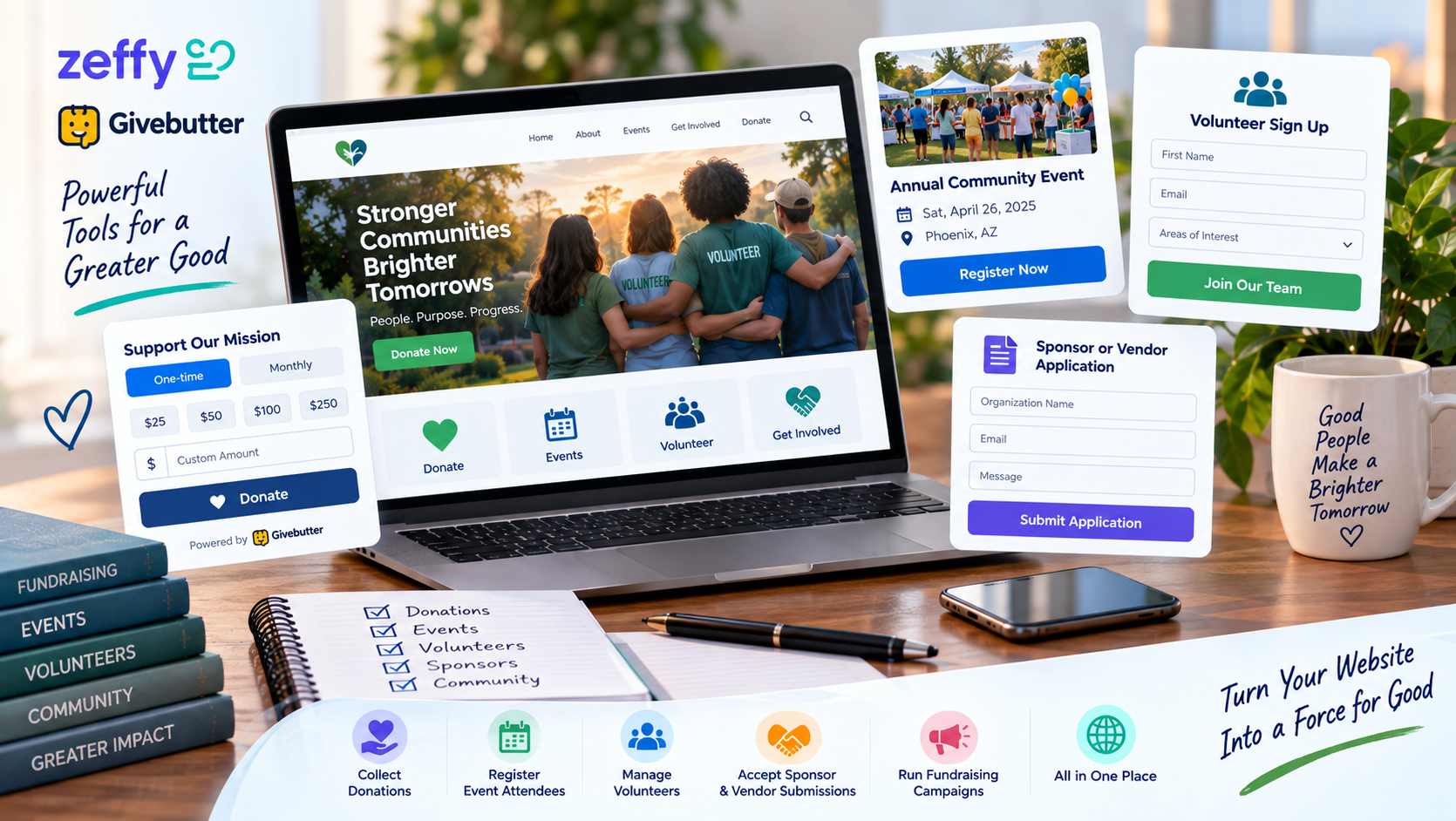
Bury your donate button in the footer, or make people click through several submenus to find it, and you've told supporters their gift is an afterthought. A mid-sized animal shelter increased recurring donations by 30% simply by moving its donate button into the primary navigation and adding a monthly giving toggle. Your donation form should be the easiest thing to find on every page, with as little friction as possible between intent and gift.
Lack of Recurring Giving Options
One-time gifts sustain operations, but recurring revenue is what builds real resilience and lets you plan further ahead. Skip a simple monthly-giving toggle, and you're asking donors to remember to come back and give again on their own, which quietly cuts into lifetime value compared to an automated sustainer program. Make recurring giving the default, or at least the most visible option, and your site starts working toward the same sustainability goals your budget depends on.
Missing Trust Signals on Payment Pages
Even a committed donor hesitates when a payment page has no visible security cues at the exact moment they're about to hand over their card details. SSL badges, charity ratings, a clear privacy policy: these belong right on the donation form, not buried on another page. Leave them off and you'll likely see higher abandonment, especially from first-time donors who have no prior relationship with your organization to fall back on.
Mobile Responsiveness and Accessibility Oversights
Design only for desktop, and you're ignoring how most people actually browse and give today. Accessibility and responsiveness aren't nice extras. They're what it takes to reach your full audience.
Ignoring Mobile-First Donor Behavior
Over half of nonprofit website traffic now comes from mobile devices, yet many organizations still don't have a fully responsive donation form. Small screens call for larger touch targets, simpler menus, and content stacked vertically to fit how people actually hold and scroll their phones. Understanding the importance of mobile responsive web design matters because a broken mobile experience tells visitors your organization hasn't kept up.
Failing WCAG Compliance Standards
Web Content Accessibility Guidelines exist so people with disabilities can perceive, understand, and navigate your website like anyone else. Accessibility is a legal requirement under ADA interpretations, and it's a mission-critical value for any charity that says it serves the whole community. Poor color contrast, missing alt text, broken keyboard navigation: each one shuts a door on the inclusive spirit the nonprofit sector claims to stand for.
Content and Messaging Gaps That Confuse Visitors
Your staff knows your programs inside and out. Visitors arriving from social media or a search engine don't, and they need to understand what you do and why it matters to them within seconds. Closing that gap takes a content strategy built around the outsider's perspective, not your team's institutional memory.
Unclear Mission Statements Above the Fold
Vague language like "making a difference" or "empowering communities" tells a first-time visitor nothing specific. Your above-the-fold content needs to say exactly who you serve, what problem you solve, and how the visitor can help, within about three seconds of landing on the page. Clarity beats cleverness every time you're asking a stranger to invest in your work.
Outdated Impact Stories and News
Stale content tells visitors your organization has gone quiet, and that quietly undercuts confidence that donations get used well, even if your programs are running fine behind the scenes. Regular updates show you're active, and they give supporters fresh evidence their contributions are producing results. An archive full of posts from two years ago reads as abandonment. Recent stories read as relevance.
Technical and SEO Mistakes Limiting Reach
Beautiful design means nothing if nobody finds your site, or leaves before they see it. Technical performance and search visibility are the foundation everything else in engagement rests on, which makes them non-negotiable.
Slow Page Load Speeds
Heavy images, unoptimized code, too many plugins: all of it adds up to load delays that drive away impatient visitors and hurt your search rankings at the same time. Most people expect a page to load in under three seconds, and each additional second of delay shows up as a measurable drop in engagement and conversion. Optimizing your assets isn't a technical chore. It's a direct intervention in donor retention and acquisition.
Neglecting Local SEO for Community Support
Nonprofits serving a specific area miss real opportunities when they skip location-based search terms. Local SEO matters for reaching community-based donors and volunteers who'd rather support an organization with a presence in their own neighborhood. Claim your Google Business Profile, keep your name, address and phone number consistent everywhere they're listed, and build out location-specific content, so neighbors can find you when they search for ways to give back locally.
Strategic Planning Failures in Web Management
A website with no strategic intent behind it is a digital brochure, not a fundraising engine. Intentional planning is what turns passive traffic into active participation, through deliberate architecture and real measurement.
No Clear Call-to-Action Strategy
Every page should point visitors toward a specific next step: donate, volunteer, subscribe, learn more. A site that acts like a digital brochure, with no clear direction for visitors, wastes the moments when motivation is highest. Reviewing nonprofit website design ideas that drive donations can help you figure out where calls-to-action belong across your site.
Skipping Analytics and Donor Tracking
Without tracking user behavior, you can't tell which pages drive engagement or where the donation funnel is leaking prospects. Proper analytics let you test ideas, measure how a campaign actually performed, and put resources where the evidence points instead of guessing. Exploring strategies to improve website conversion rate starts with the kind of data only systematic tracking can give you.
Recognizing these problems is one thing; fixing them takes dedicated technical work and planning suited to your organization. If this list has you rethinking your current site, now's a good time to act, before your next fundraising cycle begins. You can schedule a free website consultation for a personalized audit that shows which of these mistakes affect your organization, and where to fix them first for the biggest impact.
How many of these mistakes does the average nonprofit site have?
It varies, but in Easy-Click's audits, donation pages sitting five or more clicks from the homepage are a common and correctable problem, and they consistently line up with higher abandonment.
Is mobile responsiveness really that urgent?
Yes. Over half of nonprofit website traffic comes from mobile devices, and a donation form that isn't fully responsive on a phone is turning away more than half your potential donors before they even reach the payment step.
What's the fastest fix on this list?
For most organizations, it's moving the donate button into the primary navigation and adding a monthly giving toggle. One animal shelter saw recurring donations rise 30% from that change alone.
Do small visual details like an outdated copyright date really matter?
Yes. Donors read website quality as a signal of organizational competence. A broken link or a stale copyright date can raise doubt before a visitor ever reads your mission statement.
Where should we start if we can only fix one thing right now?
Start with the donation path. Count the clicks from your homepage to a completed gift, and remove whatever's in the way.
Common Nonprofit Website Mistakes in 2026 FAQ
Share