
How to Add a Donation Button to Your Nonprofit Website
Adding a donation button to your nonprofit website is one of the most direct ways to turn visitor interest into mission-critical funding. Yet many organizations struggle with placement, security, and user experience. This guide breaks down how to add a donation button to your nonprofit website in a way that respects donor intent, protects sensitive data, and works across every device. You don't need to be a developer to get this right. You do need a strategy that lines up technical setup with fundraising psychology.
Key Takeaways for Adding Online Donation Buttons
- Prioritize visibility above the fold: Place your primary donate button in the top navigation bar and hero section so supporters never have to scroll to find it.
- Make sure it's mobile responsive: Mobile devices now account for more than half of all nonprofit website traffic, which makes responsive donation buttons essential for catching spontaneous giving moments.
- Build trust through transparency: Display SSL certificates, trust badges, and links to financial reports on or near the donation form to reassure donors their contributions are secure and put to use.
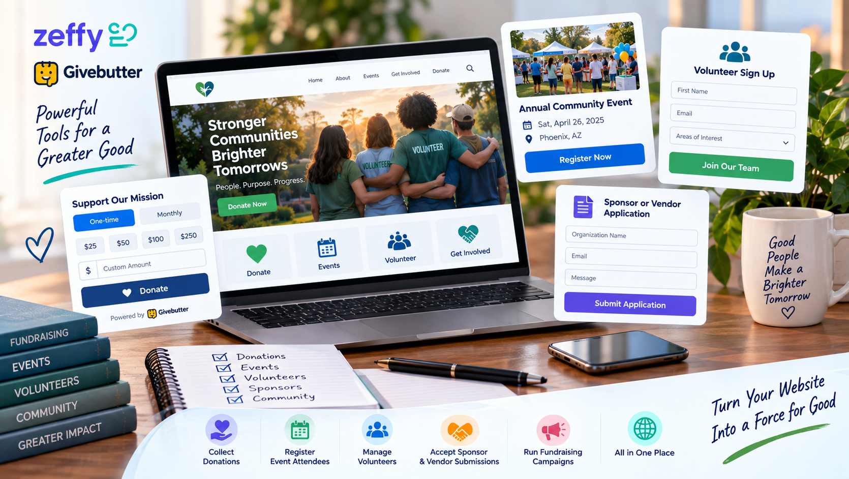
- Simplify the decision process: Use pre-set giving amounts and recurring options to cut friction. Organizations that use suggested giving amounts typically see higher average donation values than those relying on open-ended input fields alone.
- Test before launching: Check that your button works on multiple browsers and screen sizes, and confirm your platform is PCI compliant before you ask for a single dollar.

Why Strategic Donation Button Placement Drives Giving
Where you position your call to action matters as much as the message itself. Visibility correlates directly with conversion, though it never guarantees revenue on its own. When you're figuring out how to add a donation button to your nonprofit website, treat placement as a user experience decision, not just an aesthetic one. Your supporters should encounter the chance to give within seconds of landing on any page, so impulse generosity never gets blocked by poor navigation.
Above the Fold vs. Below the Fold Performance
Placing your primary donation button above the fold is still a fundamental best practice, because it captures attention before users scroll away or navigate off the page. Visitors who land on your homepage or campaign pages often arrive with high intent. Burying the giving option below the visible viewport adds friction that can cool their enthusiasm fast. Secondary calls to action can live further down the page, near your impact stories, but the main path to giving needs to stay visible the moment the page loads.
The Role of Sticky Headers and Mobile Menus
A sticky header keeps your donate button reachable even as visitors scroll deep into content about your programs or events. That persistent visibility matters most on long-form storytelling pages, where emotional engagement often peaks well below the initial view, so supporters can act the moment they feel moved. On mobile, this usually means a fixed bottom bar or a hamburger menu that features the giving option prominently, keeping it within thumb's reach no matter the screen size.
Choosing the Right Donation Platform for Your Mission
Picking the right backend system is a foundational step. It shapes both the donor's experience and how efficiently your team can run things. Easy-Click Web Design helps nonprofits set up secure, accessible donation systems that integrate with existing websites without requiring complex technical management. Still, understanding the trade-offs between platform types helps you pick the one that actually fits your needs.
Integrated Forms vs. External Payment Gateways
Embedded forms keep donors on your website for the entire transaction. That keeps your branding consistent and cuts the anxiety that comes with getting redirected to a third-party site. External gateways sometimes offer lower setup costs or simpler compliance management, but they introduce a jarring visual break that can cause supporters to abandon the process mid-transaction. For small and mid-sized nonprofits focused on building long-term donor relationships, the seamless feel of an integrated form usually outweighs the small convenience external processors offer.
Evaluating Fees and Donor Data Ownership
Transaction fees vary a lot between providers, and those costs add up fast once you're processing hundreds of small gifts a year. Beyond the percentage taken from each gift, check whether the platform gives you full ownership of donor contact information and giving history for future stewardship. A platform that locks supporter data behind its own interface creates dependency, and it gets in the way of cultivating relationships through email, direct mail, or personal outreach outside the donation tool itself.
Designing High-Converting Donation Buttons and Forms
Visual design and copywriting work together to move visitors from passive reading to active giving. Clear, consistent calls to action cut friction in the donor journey and help visitors go from interest to contribution with minimal confusion, turning your website from a digital brochure into a working fundraising engine.
Color Psychology and Accessible Contrast Standards
Your donation button should stand out with high contrast against the background, so it's instantly clear it's something to click. Color psychology suggests certain hues evoke trust or urgency, but accessibility standards matter more: contrast ratios need to be high enough that visually impaired users can see and use the button without strain. Meeting WCAG guidelines expands your potential donor base, and it signals professionalism to every visitor.
Suggested Giving Amounts and Recurring Options
Presenting pre-set donation tiers anchors expectations and helps supporters decide quickly, without agonizing over what amount feels right. Adding a recurring giving option alongside one-time gifts encourages steadier revenue, since monthly donors provide predictable income that stabilizes cash flow across the year. Defaulting to a recurring option, or just highlighting it visually, can meaningfully increase lifetime donor value without adding complexity to the form.
Building Trust Through Security and Transparency
Donors need assurance that their financial information is safe and that their contribution will actually be used well. Technical security measures and emotional trust signals work together here, turning hesitant visitors into confident supporters who come back.
Displaying SSL Certificates and Trust Badges
An SSL certificate is non-negotiable for any page collecting payment information. Displaying visual cues like padlock icons reassures users that their connection is encrypted. Third-party trust badges from recognized security firms or charity evaluators add social proof beyond your own claims about your organization. Place these elements near the submit button or payment fields, where anxiety about data safety tends to peak during checkout.
Linking to Financial Reports and Impact Stories
Transparency goes beyond technical security. It also means showing clear evidence of how funds create change. Linking to audited financial statements, annual reports, or specific program outcomes near the donation form lets skeptical donors verify your credibility without leaving the giving flow. This kind of accountability bridges the gap between emotional appeal and rational verification, satisfying both the heart and the head of a prospective supporter.
Testing and Optimizing Your Donation Experience
Launching your donation button isn't the finish line. It's the start of an ongoing improvement cycle. Regular optimization keeps your system working as user behavior, browsers, and accessibility standards change over time.
Mobile Responsiveness Checks Across Devices
Test your donation flow on real smartphones and tablets, not just a desktop browser's resizing tool, because touch targets and loading speeds behave differently on real hardware. Mobile responsive design importance can't be overstated when more than half of your traffic arrives on handheld devices. A form that looks perfect on a laptop can be unusable on a phone with a smaller screen or a slower connection. Testing regularly across iOS and Android prevents silent failures that quietly cost you donations from mobile-first supporters.
A/B Testing Button Copy and Placement
Trying out different call-to-action phrases shows you which language resonates with your specific audience. Testing variations like "Give Now," "Support Our Mission," or "Donate Monthly" gives you real data about donor preference, which beats guesswork every time. Even small changes to button color, size, or the whitespace around it can move conversion rates, as long as you validate the change through a real test rather than a hunch.
Frequently Asked Questions About Nonprofit Donation Buttons
Do I need a merchant account to accept online donations?
Most modern nonprofit donation platforms bundle merchant services directly into their solution, so you don't need to set up a separate bank merchant account. This simplifies setup and puts PCI compliance in the provider's hands, though some larger organizations still prefer dedicated merchant accounts for more control over fee structures and settlement timing.
How do I make sure my donation button is ADA compliant?
ADA compliance calls for sufficient color contrast, keyboard navigability, and screen reader compatibility across every interactive element, including donation buttons. Using semantic HTML labels, ARIA attributes where needed, and testing with assistive technologies helps donors with disabilities complete transactions on their own. WCAG 2.1 AA standards give you a concrete framework for meeting legal and ethical accessibility obligations.
What is the best call-to-action text for a donate button?
The most effective call-to-action text is specific, action-oriented, and matched to the emotional context of the page it sits on. "Donate" is universally understood, but phrases like "Give Hope Today" or "Join Our Monthly Community" often perform better, because they connect the act of giving to real impact or a sense of belonging. Test a few variations with your own audience to find what drives the most engagement for your mission.
Adding a donation button means balancing technical precision with human-centered design. Get it right, and your website becomes a reliable fundraising partner instead of just a digital brochure. If you want personalized guidance on setting up a secure, high-converting donation button without the technical overwhelm, schedule a free demo with Easy-Click Web Design to talk through your organization's specific needs.
Share