
Nonprofit Website Design Near Me: How to Choose Locally
Searching for nonprofit website design near me brings up a long list of firms, and most of them look alike at first glance. Polished portfolios and friendly home pages don't tell you whether a designer can set up recurring gifts, build a form that a screen reader can use, or send you to a food pantry that would happily vouch for the work.
This guide gives you four checks that matter more than a zip code. Run them before you sign anything, and your shortlist gets shorter fast.
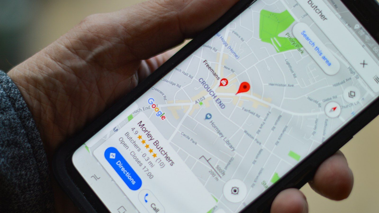
What "Near You" Should Mean for Nonprofit Website Design
You don't need a designer in your own city. Proximity helps in a few specific situations: an in-person kickoff with your board, a working session at your office, or a designer who already knows the local businesses, donors and events your community rallies around.
It does not prove nonprofit experience, though. A firm down the street that has never built a donation flow is a weaker choice than a specialist several states away who has built them again and again.
Treat "near you" as a filter, not a verdict. Use it to build a first list, then judge every name on the criteria below.
Easy-Click Web Design serves nonprofits in Arizona and the Phoenix area, and also works with organizations beyond the local market. If you're in the Valley, a leader's guide to nonprofit website designers in Phoenix covers the local picture, so this piece stays on how to evaluate. If you're typing "nonprofit web designer near me" into a search box, the questions that follow work the same way wherever you are.
Start With Donation Integration Experience
A donate button is the easy part of online giving. What separates an experienced nonprofit designer from a general one is everything that happens after the click, and you can test for that before you hire anyone.
What a Working Donation Setup Includes
Think of the giving path as a chain. If one link breaks, the donor never sees the rest, so the whole chain has to work from start to finish:
- The donation form: clear amount choices, few fields, and easy use on a small screen.
- A recurring-gift option: so a supporter can give monthly without starting over each time.
- Phone checkout: because many donors arrive from a social post and never open a laptop.
- Confirmation: a clear on-screen message and an email confirming the gift went through.
- A thank-you email: one that sounds like your organization, not a receipt template.
- The donor record: the gift lands somewhere your team can find it, so follow-up doesn't depend on someone's memory.
Calls to action belong at the front of that chain. Buttons like "Donate," "Volunteer" or "Register" should lead straight into the matching form, not into a general contact page.
Picture a spring appeal where many visitors arrive on a phone from a social post. If the donate form is hard to complete on a small screen, or no thank-you page follows the gift, the donor's intent is lost at the moment it mattered most.
Two Easy-Click guides can help you prepare. One explains how a donation button should be set up, and another puts donation platforms compared side by side, which matters because the platform you pick shapes the integration work. For the phone side, see making a nonprofit website mobile friendly.
Questions That Reveal Hands-On Giving Experience
Anyone can say "yes, we do donations." Specific answers show who has actually done it. Ask these and listen for detail:
- Who sets up and secures the payment connection, and who holds the account?
- After each site update, how do you retest the giving path, and who runs a test gift?
- Can you walk me through a recent donation flow you built, from form to thank-you email?
- What happened when something broke, and how fast was it fixed?
A designer with real experience answers with steps, tool names and a story about a problem they solved. A vague answer, or one that circles back to how nice the button looks, tells you the work stayed on the surface.
Be wary of anyone who promises that a new site will raise your donations. No designer controls that, and a good one won't pretend to.
Check Accessibility Knowledge That Reaches More Donors
Accessibility sounds technical, but the idea is simple: more people can read, navigate and give on your site, including supporters who use assistive tools. For a nonprofit, that means more potential donors and volunteers can actually get through your front door.
What Accessibility Means for Donors and Volunteers
In plain terms, an accessible website has these basics in place:
- Text that is easy to read, with enough contrast against the background.
- Menus and buttons that work with a keyboard alone, not just a mouse or touch screen.
- Form fields with clear labels, so a screen reader announces what each box is for.
- Descriptive text for images, so someone who can't see a photo still gets its meaning.
- Captions on video, so your story reaches people who can't hear it.
Consider a longtime donor with low vision who wants to give monthly, or a volunteer who navigates by keyboard after a hand injury. If the donation form has unlabeled fields, they stop at the form, and you may never know they tried.
The shared yardstick is the Web Content Accessibility Guidelines (WCAG), published by the World Wide Web Consortium. Level AA is the common conformance target, so a designer who can name it and explain what it covers is a good sign.
Questions That Show Real Accessibility Practice
Accessibility practitioners generally treat WCAG conformance as ongoing testing with a keyboard and a screen reader, not a checkbox completed at launch. That gives you a clear way to separate real practice from a line on a services page. Ask:
- Do you test with a keyboard and a screen reader, or only with an automated scanner?
- Which WCAG level do you build toward, and how do you check it?
- How do you document fixes, so we can see what changed and why?
- What happens when we add a new page or form after launch?
Strong answers describe a routine: tabbing through every page, listening to the donation form read aloud, and keeping a written list of issues found and resolved. Weak answers lean on "we use an accessibility plugin."
Keep the limits in view. Accessibility is good practice that widens who can give and volunteer. It is not a legal guarantee, and no designer can promise your site will never draw a complaint. For legal questions, talk to a qualified attorney.
Verify Nonprofit References Before You Trust a Portfolio
A beautiful portfolio shows taste. It doesn't show whether the designer understands how nonprofits work, so look past the screenshots.
Look for Missions and Scale That Match Yours
A designer who has worked with a food pantry, a faith-based community program or an arts nonprofit will recognize your constraints: a small team, a tight budget and a board that wants to see the mission up front. Look for groups with a mission and size close to yours.
Pay attention to which pages the portfolio shows. A portfolio that shows an event registration page, a volunteer sign-up flow, or a campaign donation page says more about a designer's nonprofit experience than a gallery of generic brochure sites, because those are the paths that carry donor and volunteer engagement.
Then ask what changed for those groups after launch. You're not hunting for a statistic. You want a concrete answer, such as "the team now updates event pages without calling us," or "volunteers sign up online instead of by email."
First-time donors also judge you in seconds. A professional design and clear impact stories help them decide you're trustworthy enough to give to.
Call References and Read Testimonials Critically
Ask for two or three references you can actually call, and make the calls. Useful references are specific: a named organization, a described project scope, and a contact who can explain what was difficult, how changes were handled, and how support worked after launch.
When you read testimonials, weigh them like this:
- Stronger: a named organization, a specific project, and a candid note about what was hard.
- Weaker: "Great team, loved working with them," with no name, no project and no detail.
A reference who admits the schedule slipped but says the designer stayed calm and fixed it is more useful than five paragraphs of praise.
What to Settle Before You Hire a Nonprofit Website Designer
Once a designer passes the first three checks, the paperwork decides whether the relationship stays healthy. Get these terms in writing before you sign, because they're awkward to renegotiate later.
- Ownership: your organization should own the domain name, the content and the accounts, with your name on the registrations.
- Post-launch support: find out what it includes, how long it lasts, how to reach someone, and what counts as extra.
- Staff updates: a person with limited time should be able to change an event or donation page without calling a developer.
- Pricing: every item listed separately, so add-ons such as forms, hosting or training don't appear later.
If you're not sure what the project should cover, start with what a nonprofit website should include. A clear scope makes pricing questions much easier to answer.
Some warning signs suggest a designer is a poor fit for a nonprofit:
- A guarantee of more donations or higher search rankings.
- A vague scope, with phrases like "fully custom" and no list of what's included.
- No nonprofit references, or references who can't be reached.
- Reluctance to say who owns the domain and accounts.
- No answer on how the giving path gets tested after changes.
A Simple Shortlist Scorecard
Use this table to compare two or three designers side by side. Fill it in during calls, not afterward from memory.
| Criteria | What to ask | What a strong answer sounds like |
|---|---|---|
| Donation integration | Walk me through a recent donation flow you built. | Names the form, recurring option, phone checkout, thank-you email and donor record, and explains testing. |
| Accessibility | How do you test, and how do you document fixes? | Tests with a keyboard and a screen reader, builds toward WCAG AA, keeps a written fix list. |
| Nonprofit references | Who can I call about a similar project? | Offers named organizations with similar missions, including event or volunteer pages. |
| Ownership | Who holds the domain, content and accounts? | Your organization, in writing, from day one. |
| Support | What happens after launch? | A clear scope, a named contact and a plain list of what costs extra. |
| Pricing | How is the quote itemized? | Separate line items, with no surprise add-ons. |
A scorecard won't make the decision for you, but it keeps a smooth sales call from outweighing an unanswered question.
If you'd like a second set of eyes while you compare, you can book a call to talk through your website goals and walk through your own donation, accessibility and reference checks. If you're not ready to talk to a designer yet, The Nonprofit Technology Guide offers practical tools and strategies for building a better digital presence on a nonprofit budget, and you can read it at your own pace.
Frequently Asked Questions
Is a local nonprofit website company the right choice?
It can be, if you value in-person meetings and a designer who knows your community. Location alone isn't enough, though. Choose the designer who passes the donation, accessibility and reference checks, and treat being nearby as a bonus.
Where can I find nonprofit website help?
Start with peers. Ask leaders at similar organizations who built their sites and whether they'd hire that person again. Board members, volunteers and fellow nonprofits in your area are also good sources, and a designer's own client list can point you to people to call.
What should a first call with a website designer include?
Bring your goals, such as more online gifts, easier event registration or volunteer sign-up. Ask the designer to walk through a recent donation flow and explain how they test for accessibility. Before you hang up, find out who will own the domain and accounts and how the quote is itemized.
Can a designer promise that a new website will raise donations?
No. A site can make giving easier and your mission clearer, but no designer controls how many people give or how a page ranks in search. Treat any guarantee as a warning sign and look for a designer who talks about the work they'll do instead.
Share